Nora Consultoria Agronômica
PT.
Nora se trata de uma empresa de consultoria agrônoma com o foco no público classe A.
Para desenvolver esta identidade visual busquei a origem do nome Nora. Nesse processo de descoberta encontrei a história desse nome/sobrenome fantástico.
Nora é um nome de origem norueguesa e significa algo que é reluzente.
Para desenvolver esta identidade visual busquei a origem do nome Nora. Nesse processo de descoberta encontrei a história desse nome/sobrenome fantástico.
Nora é um nome de origem norueguesa e significa algo que é reluzente.
-
EN.
Nora is an agronomic consulting company focused on the class A public.
To develop this visual identity, I looked for the origin of the name Nora. In this discovery process I found the story of this fantastic name / surname.
Nora is a name of Norwegian origin and means something that is shiny.
To develop this visual identity, I looked for the origin of the name Nora. In this discovery process I found the story of this fantastic name / surname.
Nora is a name of Norwegian origin and means something that is shiny.
Client: Nora | Service: Visual Identity | Country: Vilhena, RO | Year: 2022 | Art Director: Gleiber Domingos

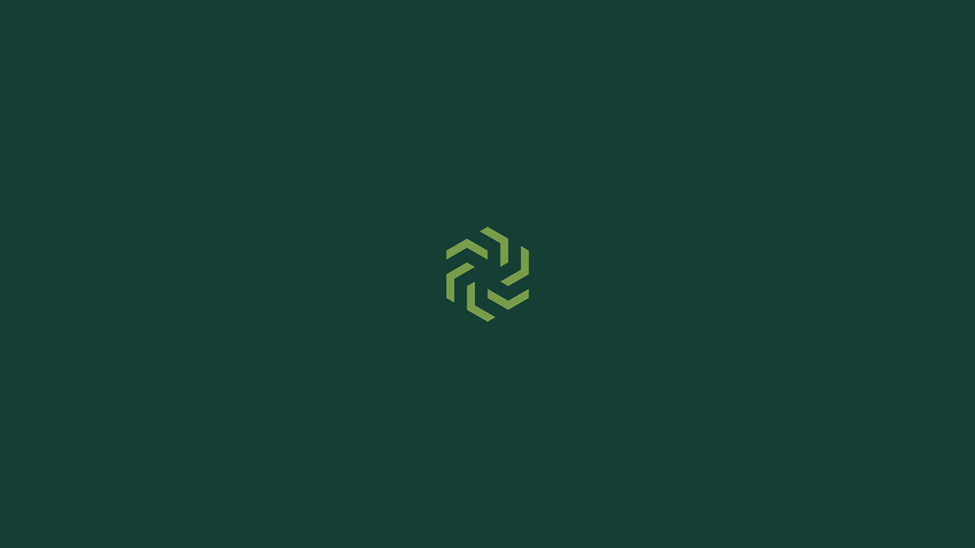
PT. Símbolo
Para desenvolver o símbolo busquei a origem do nome Nora. Nesse processo de descoberta encontrei a história desse nome/sobrenome fantástico.
Nora é um nome de origem norueguesa e significa algo que é reluzente.
Nesse processo entendi que poderia fazer uma conexão com um fator determinante no processo da agronomia, o Sol.
O sol é reluzente em nossas vidas.
O sol é a base de tudo, fornece energia para plantações e traz a clareza. O sol é a base da vida. Este é o significado do nome Nora.
O símbolo pode ser enxergado como um sol, mas no seu espaço negativo (partes internas) remete aos trilhos de plantações, que por muitas vezes são verticais ou horizontais dependendo do local.
O símbolo é composto por 6 setas em ângulos diferentes para gerar esse formato arredondado, isso gera uma ideia de movimento, assim como o sol, que está sempre em movimento.
Nora é uma empresa séria, que sempre busca elevar o seu nível — ou seja, sempre está caminhando, em movimento. O símbolo reforça isso.
-
EN. Symbol
To develop the symbol I looked for the origin of the name Nora. In this discovery process I found the story of this fantastic name/surname.
Nora is a name of Norwegian origin and means something that is shiny.
In this process, I understood that I could make a connection with a determining factor in the agronomy process, the Sun.
The sun is shining in our lives.
The sun is the foundation of everything, it provides energy for crops and brings clarity. The sun is the basis of life. This is the meaning of the name Nora.
The symbol can be seen as a sun, but in its negative space (internal parts) it refers to plantation rails, which are often vertical or horizontal depending on the location.
The symbol is composed of 6 arrows at different angles to generate this rounded shape, this generates an idea of movement, just like the sun, which is always in motion.
Nora is a serious company, which is always looking to raise its level — that is, it is always moving forward. The symbol reinforces this.

PT. Cores
Para desenvolver a paleta de cores aderi às sugestões ditas no questionário de manter as cores do logo anterior.
O verde é a cor chave do projeto. A paleta trabalha em diferentes tons de verdes.
Entretanto, resolvi fazer uma adaptação nesta paleta, para fazer mais sentido com os atributos ditos no questionário.
O verde mais escuro traz um ar elegante, junto ao cinza mais claro traz contraste para a marca.
Formando um conjunto sofisticado.
Uma paleta com tons mais sóbrios e elegantes. Cores mais frias transmitem uma ideia de seriedade muito maior.
Elegância e sofisticação resumem esta paleta.
Como cores de apoio escolhi o amarelo que simpatiza com o conceito do sol, o verde mais claro para momentos que necessitarem de mais destaques e o preto que também representa sobriedade.
-
EN. Colors
To develop the color palette, I adhered to the suggestions mentioned in the questionnaire to keep the colors of the previous logo.
Green is the key color of the project. The palette works in different shades of green.
However, I decided to adapt this palette to make more sense with the attributes mentioned in the questionnaire.
The darker green brings an elegant air, together with the lighter gray brings contrast to the brand.
Forming a sophisticated set.
A palette with more sober and elegant tones. Colder colors convey an idea of much greater seriousness.
Elegance and sophistication sum up this palette.
As support colors I chose yellow that sympathizes with the concept of the sun, lighter green for moments that need more highlights and black that also represents sobriety.


PT. Tipografia
A tipografia principal se chama ''Aventa''.
Optei por escolher uma tipografia geométrica, com formas mais quadradas e contrastantes. Esta tipografia possui um ar imponente e moderno. Também é moderna e bem versátil, possui várias categorias de pesos para gerar mais contraste em diferentes aplicações.
A tipografia secundária se chama ''Be Vietnam'' e foi escolhida apenas como apoio. Serve para diagramações e materiais diversos.
Entretanto é interessante sempre optar pela tipografia primária (do logo).
-
EN. Type
The main typography is called ''Aventa''.
I chose to choose a geometric typography, with more squared and contrasting shapes. This typography has an imposing and modern look. It is also modern and very versatile, it has several categories of weights to generate more contrast in different applications.
The secondary typography is called ''Be Vietnam'' and was chosen only as support. Serves for layouts and various materials.
However, it is interesting to always opt for the primary typography (of the logo).